A coaster has a small printable area, which means every line, logo edge and colour choice is highly visible. Meeting coaster artwork requirements before production helps avoid soft images, trimmed text, unexpected colour shifts and delays while artwork is corrected. Whether you are ordering branded coasters for a venue, a corporate campaign, a club or a wedding, print-ready artwork gives your finished product a more polished, professional result.
The right setup depends on the coaster material, size, shape and print method. A full-colour design for a cardboard coaster has different considerations from a single-colour logo on cork, leather or stainless steel. The most reliable approach is to confirm the product specification first, then build or supply artwork to the matching template.
Start with the coaster and printing method
Artwork should never be prepared in isolation from the product. Round, square and shaped coasters all have different trim lines, while a coaster with rounded corners needs a little more care around the edges than a standard square option. If the design includes a border, pattern or image reaching the edge, its placement must be planned around the finished shape.
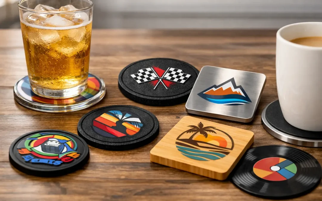
Material matters just as much. Absorbent cardboard is ideal for detailed promotional printing and large event quantities, while cork and bamboo bring natural texture that can soften fine detail. Acrylic, glass and metal can deliver crisp contemporary branding, but may use methods such as screen printing, digital printing, engraving or UV print depending on the product. Each method handles colour, gradients and tiny text differently.
Before finalising your design, confirm the coaster dimensions, printable area, preferred colour system and whether the artwork will be printed on one side or both. A free digital proof is particularly useful here because it shows how the artwork sits on the actual coaster format before production begins.
Coaster artwork requirements for files and resolution
For logos, icons, text and clean graphic elements, vector artwork is the preferred file type. Vector files can be enlarged or reduced without losing sharpness, making them well suited to custom coaster printing. AI, EPS and print-ready PDF files are generally the strongest starting point, particularly for one-colour logos, spot-colour branding and artwork that may need resizing.
High-resolution raster files can also work well for photographs, textured backgrounds or full-colour illustrations. Supply these at 300 dpi at the final printed size. A small image copied from a website, social media post or email signature is rarely suitable, even if it appears clear on a mobile or computer screen. Once enlarged for print, it can look pixelated or blurry.
JPEG, PNG and TIFF files may be accepted where they meet the required resolution. PNG files can be helpful for artwork needing a transparent background, although transparency still needs to be checked against the chosen material and print process. A PDF is not automatically print ready either. It may contain low-resolution images, RGB colours or live fonts, so the artwork within it still needs review.
If you only have a low-quality logo, it is better to raise that early rather than proceed with a compromised result. In some cases, simple artwork can be recreated as a vector file. Complex logos, detailed illustrations and photos may need higher-quality original files from the designer or brand manager.
Allow for bleed, safe area and trim variation
Commercial printing requires a small amount of tolerance at the edge of every coaster. This is where bleed and safe areas come in. Bleed is extra background artwork that extends beyond the trim line. It prevents a thin unprinted edge appearing if the coaster is trimmed fractionally differently during production.
As a general rule, background colours, photos and patterns should extend beyond the finished edge according to the supplied template. Do not stop a full-coverage background exactly at the coaster size. The template supplied for your selected product will show the correct bleed allowance.
The safe area works in the opposite direction. Keep important features such as logos, text, QR codes, phone numbers and fine borders inside this area, away from the edge. Even a small shift that is invisible on a plain background can make a tight border look uneven or cause small text to sit too close to the trim.
Borders deserve special attention. A border that runs near the edge can be effective, but it leaves little room for normal trimming tolerances. If perfect symmetry is essential to the design, consider moving the border further inward or using a full-bleed pattern instead. This gives the finished coaster a more consistent appearance across the order.
Set colours, fonts and fine details correctly
Screen colours are made from RGB light, while printed colours are usually produced in CMYK inks or specified spot colours. An RGB blue that looks bright on screen may print darker or less vivid, especially on an uncoated or natural material. For a design where colour consistency is a priority, supply approved CMYK values or Pantone references where applicable.
Pantone matching can improve consistency for brand colours, although the achievable result still depends on the coaster surface and production method. Ink on white cardboard behaves differently from print on dark cork, clear acrylic or brushed metal. Natural materials can also have small variations in grain and tone, which are part of their character rather than a production fault.
Use high contrast wherever possible. Dark text on a pale background, or pale text on a dark solid background, is easier to read at coaster size than subtle tonal combinations. Fine pale lines can disappear on textured materials, while very small reversed-out text may fill in during print.
Fonts should be embedded or converted to outlines before supply, particularly in vector files. This prevents font substitution if the original typeface is unavailable during pre-press. Avoid extremely thin weights and tiny type unless the product and print method are confirmed to support them. A simple rule applies: if a detail is difficult to read at actual size on screen, it is unlikely to improve in print.
Adapt the design to the coaster material
A design that looks excellent on gloss acrylic may not be the best choice for cork or leather. Matching the artwork to the material creates a stronger finished piece and avoids spending on features the surface cannot reproduce clearly.
Cardboard coasters suit detailed logos, event messaging, photos and promotional campaigns where high-volume distribution matters. Cork, bamboo and leather are often better with bolder logos, clean linework and designs that complement the material’s natural appearance. Engraved artwork typically works best as solid, simplified shapes rather than gradients or photographic images.
Glass, aluminium, stainless steel and acrylic options can support sharper contemporary graphics, but white ink may be needed when printing light artwork onto a coloured, dark or transparent surface. If the design relies on white, metallic effects or clear areas, make this clear when requesting a quote so it can be assessed correctly.
For hospitality use, consider how the coaster will perform after repeated handling and contact with condensation. Busy promotional artwork may be appropriate for an event handout, while a venue logo with a clean, durable layout can offer better long-term table presentation.
Check the digital proof before approval
A digital proof is the point to check spelling, logo placement, orientation, colour references, dates, contact details and the final coaster shape. It is also the time to confirm that double-sided artwork has the correct front and reverse designs. Once production is approved, changes can affect turnaround and may incur additional costs.
View the proof at a realistic size where possible. Check whether key text feels crowded, whether a QR code has enough clear space around it and whether the design remains legible from a quick glance across a table. For event coasters, check dates and venue details with the same care you would give a printed invitation or campaign sign.
Drink Coaster provides digital proofs to help customers approve the layout with confidence before custom manufacturing begins. Clear feedback at this stage keeps production moving and gives the team the best chance of delivering exactly what you intended.
Send artwork with the details that matter
When submitting artwork, include the coaster product or material, required quantity, finished size, print sides and any brand colour references. If there are multiple logo versions, identify the approved version rather than leaving the choice open. For supplied files, use clear names such as “front”, “reverse”, “white ink” or “Pantone colour” so there is no uncertainty during artwork review.
Good artwork preparation is not about making the process complicated. It is about giving a small, highly visible promotional product the care it deserves. Start with the right template, allow room around the edges, keep details clear and use the proof to make final decisions. That preparation helps turn a practical coaster into branding guests, customers and clients will notice every time they put down a drink.