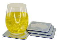

A coaster gets only a few seconds of attention, usually between the first sip and the next round. That is exactly why learning how to design custom coasters properly matters. If the design is clear, well matched to the material, and built for the setting it will be used in, a coaster can do more than protect a table – it can reinforce a brand, lift an event setup, and keep your message in front of people without feeling forced.
For venues, clubs, corporate buyers and event organisers, the best coaster designs are rarely the busiest. They are the ones that feel considered. Good design starts with understanding where the coaster will be used, who will see it, and what you want it to achieve.
Start with the job the coaster needs to do
Before you pick colours, logos or finishes, decide what success looks like. A branded cardboard coaster for a busy bar has a different job from a set of engraved leather coasters for client gifts or bamboo coasters for a wedding reception. One needs to be cost-effective in volume and highly visible. The other needs to feel premium and memorable.
This is where many designs go off track. People begin with artwork instead of use case. If your coasters are for a hospitality venue, durability, print clarity and quick brand recognition usually matter most. If they are for a one-off event, styling and theme consistency may be the priority. If they are for a promotion, then budget per unit and strong logo placement often lead the brief.
Once the purpose is clear, the design decisions become much easier. You can choose a material, shape and print method that fit the job instead of forcing one idea across every application.
How to design custom coasters for different materials
Material has a direct effect on how your design will look and how long the coaster will last. It also shapes what kind of artwork will reproduce well.
Cardboard and pulp board coasters are popular for promotions, pubs, clubs and events because they are economical and easy to produce in volume. They suit bold logos, simple layouts and high-contrast colour. Fine detail can work, but only if the artwork is prepared properly and the design is not overcrowded.
Acrylic, glass and resin coasters give you a cleaner, more polished look. They are better suited to permanent use, gifting or premium brand presentation. On these materials, sharp lines and minimal layouts often look stronger than designs trying to fill every millimetre.
Cork, bamboo and leather bring texture into the design. That can be a strength, but it changes how artwork reads. Natural materials tend to suit simpler marks, strong type and restrained use of colour. If your branding relies on gradients or tiny text, a textured surface may not be the best fit.
Metal options such as stainless steel and aluminium can create a sleek, corporate finish. They work well for engraved marks, clean branding and upmarket hospitality settings. PVC rubber is different again – it suits bold, playful shapes and strong colour blocking, especially for promotional campaigns where durability matters.
The trade-off is straightforward. More premium materials can elevate your brand presentation, but they usually come with a higher unit cost and sometimes tighter design limits depending on the production method. Budget-friendly materials offer scale, but they need disciplined artwork to avoid looking generic.
Keep the design clear at coaster size
A coaster is a small format item. That sounds obvious, but it is one of the biggest design considerations. Artwork that looks balanced on a laptop screen can become cluttered very quickly once reduced to 90 or 100 millimetres.
The safest approach is to focus on one key message. That might be your logo, a campaign line, an event monogram, or a short callout. Trying to include too much usually weakens the result. A mobile number, website, QR code, social handle, tagline and logo all on one coaster can feel more like packaging than a polished promotional item.
If the logo is the priority, give it space. If the event name matters most, build the layout around that. If you want a promotional message to stand out, keep supporting elements secondary. White space is not wasted space. It is what helps the main design read quickly.
Typography matters just as much. Small or ornate fonts can disappear once printed, especially on textured or absorbent materials. Stick with clear typefaces and make sure the main text is readable at a glance. If someone has to pick up the coaster and squint, the design is too fine.
Use colour with production in mind
Colour selection is not only a branding issue. It is a production issue as well. Different materials absorb ink differently, and some finishes can slightly shift the appearance of colour. A dark background with fine light text may look sharp on screen but lose clarity in print if the material is porous or the text is too thin.
For most projects, contrast wins. Dark on light or light on dark tends to perform better than low-contrast combinations. Brand colours should still be respected, but it is worth adjusting layouts to preserve legibility rather than insisting on a palette that does not reproduce well on the chosen surface.
This is also where a digital proof is valuable. It gives you a chance to check spacing, alignment, scale and colour balance before production starts. For commercial orders especially, that extra review step can prevent costly reprints and delays.
Shape and finish should support the brand
Round coasters are the standard for a reason. They suit most glasses, stack neatly and feel familiar in hospitality settings. Square coasters can look more contemporary and work well for corporate branding or wedding styling. Custom shapes can be effective too, but only when they are practical.
If you choose a custom die-cut shape, make sure it still functions like a coaster. Overly narrow edges, awkward points or excessive cut-outs can affect durability and usability. A shape should add to the brand story, not create an item people avoid using.
Finishes deserve the same level of thought. Matte can feel understated and professional. Gloss can make colours pop. Engraving can add permanence. Embossing can create a tactile premium look. The right finish depends on the brand and the setting. A nightclub promotion and a boardroom gift set should not look the same, even if the logo is identical.
Design for the setting, not just the brand guide
One of the most practical ways to improve a coaster design is to picture it in use. Will it sit under schooners in a busy sports bar? On café tables in natural light? At a formal wedding with neutral styling? In welcome packs for a corporate conference?
A strong coaster design fits its environment. Hospitality coasters usually need immediate visibility, easy recognition and enough resilience to cope with moisture and handling. Wedding and event coasters often benefit from softer styling, balanced layouts and materials that complement the broader tablescape. Corporate coasters for offices or client gifting tend to lean cleaner, more restrained and more premium.
Brand consistency matters, but context matters just as much. Sometimes the best design choice is not using every element from the brand guide. It is selecting the few that translate well to the product and the setting.
Common design mistakes to avoid
The most common issue is trying to say too much. A coaster is not a brochure. Keep the message focused.
The next is choosing the wrong material for the artwork. Detailed designs do not always suit textured surfaces, and premium materials do not automatically improve a weak layout.
Another frequent problem is supplying low-resolution files. If the artwork is not production-ready, even a good concept can produce a disappointing result. Vector artwork is usually the safest option for logos and line work.
Lastly, do not leave design review until the last minute. If timing is tight, small changes can become rushed decisions. A clear brief, proper proofing and realistic turnaround expectations usually lead to a better finished product.
Good coaster design is collaborative
If you are working out how to design custom coasters for a venue launch, a product promotion or a special event, the smartest move is to treat design as a production decision as much as a creative one. Material, print method, budget, quantity and delivery timing all affect what will work best.
That is why experienced support matters. A supplier that can review artwork, recommend materials and provide a free digital proof can save time and improve the final result. At Drink Coaster, that practical design support is often what helps customers move from a rough idea to a coaster that looks right, performs well and suits the brief.
The best custom coaster is rarely the one with the most design elements. It is the one that feels right in the hand, looks right on the table and says exactly what it needs to say.