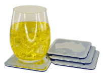
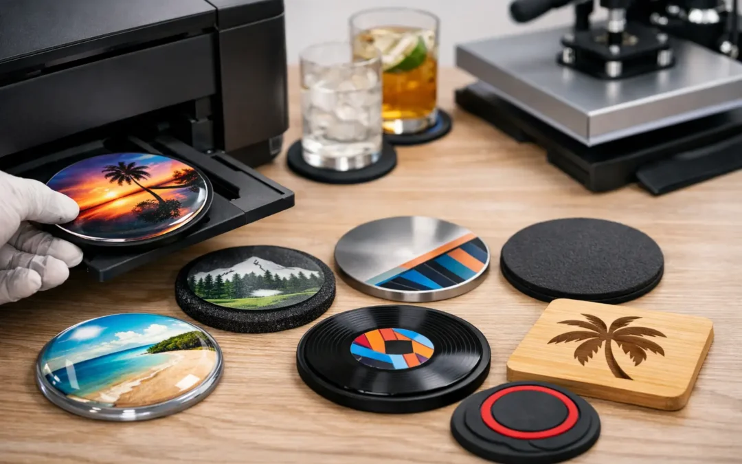
A coaster may be small, but poor artwork is immediately noticeable at a bar, café table or event setting. Knowing how to print coaster artwork properly means preparing a file that stays sharp, keeps brand colours consistent and allows for the small variations that occur during commercial production. The goal is not simply to fit a logo on a coaster. It is to create a finished promotional item that looks deliberate, professional and fit for regular use.
For businesses, venues and event organisers, a well-produced coaster puts your brand in front of customers at exactly the moment they are sitting down, socialising and spending time with it. Good artwork preparation helps make that visibility count.
Start with the coaster material and print method
Artwork should never be developed in isolation from the coaster itself. Cardboard, cork, acrylic, leather, stainless steel and PVC rubber all take print differently. A detailed, full-colour image that looks excellent on absorbent pulpboard may need a different approach when it is printed, engraved or UV cured on a hard surface.
Cardboard drink coasters are well suited to full-colour branding, event artwork, campaigns and hospitality promotions. They provide a broad printable area and work particularly well for logos, illustrations and photography, provided the image quality is high enough. Cork has natural texture and colour variation, which can give a warm, premium feel, but very fine details may not reproduce as crisply as they would on a smooth coated surface.
Hard coasters such as acrylic, metal, glass and resin offer a more durable presentation. Depending on the product, decoration may involve digital printing, screen printing, laser engraving or a printed insert. Laser engraving creates a refined, permanent mark, but it does not reproduce full-colour artwork. If exact brand colours or photographic detail are essential, select a material and printing process designed for colour reproduction.
The practical question is simple: what does the artwork need to achieve? For a venue logo and contact details, a clean one or two-colour design may be most effective. For a wedding, product launch or illustrated event theme, a full-colour printed coaster may be the better fit.
How to print coaster artwork with the correct file setup
The best artwork files are created at the final print size from the beginning. Most coasters are round, square or shaped to a custom outline, so the dimensions and template need to match the selected product. Do not assume that all 90 mm round coasters have exactly the same printable area. Edge treatments, rounded corners, bevels and production methods can change the available space.
A print-ready file generally needs three areas: the finished size, the bleed area and a safe area. Bleed is artwork that extends beyond the final edge of the coaster. It allows the printer to trim or cut the product without leaving a thin, unwanted white line around the design. As a general guide, 3 mm of bleed is commonly used, though the product template should always take priority.
The safe area sits inside the finished edge. Keep logos, text, QR codes and important design details comfortably within it. A border placed very close to the edge can look uneven after cutting, even when the production is within normal tolerances. For this reason, solid background colours and full-bleed imagery are usually safer than narrow border designs.
For logos and line artwork, supply a vector file where possible. PDF, AI and EPS files preserve crisp edges because they are built from scalable paths rather than pixels. For photographic or raster artwork, use a high-resolution file at the final printed size. A resolution of 300 dpi is the usual benchmark for quality commercial printing.
Avoid enlarging a small image pulled from a website or social media page. It may appear acceptable on a mobile screen, but it can become soft, pixelated or blocky once printed. If the only available logo is low resolution, it is often worth locating the original brand files before production begins.
Set colours for print, not just screens
Screens use RGB light to display colour, while many commercial print processes use CMYK inks. This is why a bright blue or fluorescent green on screen may print differently on a physical coaster. Convert artwork to CMYK where requested and use recognised Pantone references when colour matching is critical.
Exact colour results can also depend on the surface. Ink on white cardboard will look different from ink on natural cork, brushed metal or clear acrylic. A white underbase may be required for artwork printed onto clear or dark materials, otherwise colours can appear translucent or muted. This is not a fault in the artwork. It is a material decision that should be resolved before the file is approved.
Design for a small, practical surface
A coaster is not a brochure. It has limited room, and drinks can cover part of the design during use. The strongest coaster artwork prioritises one central message: a logo, event name, campaign visual or short call to action. Trying to include a full menu, multiple contact points and several small images usually creates clutter.
Choose type that remains legible at coaster size. Fine script fonts, very light lettering and tiny reverse text can lose clarity, particularly on textured materials or absorbent cardboard. As a practical starting point, keep body copy larger than you might use in a business card design, and avoid lines that are extremely thin.
If you are including a QR code, give it clear space around the edges and test it before sending the artwork. The code needs sufficient contrast and a size that can still be scanned when printed. Avoid placing it close to a curve, cut line or heavily textured background. QR codes can be highly useful for venue menus, competitions and campaign landing pages, but only if they work reliably in real conditions.
Consider how the coaster will be viewed. In hospitality settings, people often see it from different directions around a table. A centred logo works well for this reason. If the coaster has a clear front and back, use one side for branding and the other for useful information such as a booking prompt, social handle or event date.
Check your artwork before it goes to print
A careful pre-production review prevents the most common and costly artwork issues. Before submitting files, check that:
- the document matches the approved coaster size and template;
- backgrounds extend into the required bleed area;
- important text and logos sit within the safe area;
- images are high resolution at final size;
- fonts are outlined or embedded, where appropriate; and
- spelling, phone numbers, dates and QR codes have been checked by someone other than the original designer.
This final point deserves attention. A typo in a digital advertisement can be corrected quickly. A typo on thousands of printed coasters cannot. For campaigns, product launches and event orders, make sure the final approver reviews the actual proof rather than an earlier design draft.
Use a digital proof as a production check
A digital proof is where design intent becomes a production instruction. It confirms the artwork position, size, colours, cut shape and decoration method before manufacturing begins. It is also the best time to query anything that looks unclear, such as a fine line near the edge, a transparent background or a colour that appears different from the approved brand guide.
At Drink Coaster, a Free Digital Proof gives customers the chance to review their custom artwork before production. This is particularly valuable when ordering for a national campaign, a busy venue, a wedding or a time-sensitive event. It creates a clear sign-off point and reduces guesswork for everyone involved.
A digital proof cannot always replicate the exact feel of every material on screen. Natural cork grain, metallic finishes and engraved marks will have their own character. If your project relies on a very specific finish or colour match, raise that requirement early so the most suitable product and decoration process can be recommended.
Allow time for revisions and delivery
Fast turnaround is useful, but rushed artwork is one of the main causes of avoidable delays. Build time into your schedule for collecting logos, checking sponsor artwork, reviewing proofs and making final changes. This matters even more for events, where the date cannot move and coasters may need to arrive before other signage or stock is installed.
If multiple stakeholders are involved, nominate one person to consolidate feedback. Conflicting requests from a marketing team, venue manager and event organiser can slow approvals and lead to version-control mistakes. A single, final artwork file with a clear approval process keeps production moving.
The best coaster artwork balances creative ambition with the realities of material, size and print process. Keep the message clear, use files built for print and give your supplier enough information to guide the finish. That small amount of preparation helps turn an everyday table item into a dependable piece of brand presentation.