A well-designed event coaster does more than protect a table. It puts your brand, message or celebration in front of every guest from the first drink to the final toast. Knowing how to design event coasters means balancing visual impact with the practical realities of the venue, drink service, quantity and production timeframe.
For a corporate launch, the coaster may be a concise piece of branded merchandise. For a wedding, it can carry a monogram, date or personal message that becomes a small keepsake. For a club, pub or fundraiser, it needs to work hard in a busy setting while presenting a clear sponsor or venue identity. The best design begins with that purpose, rather than with a logo placed in the middle of a blank circle.
Start with the job your coaster needs to do
Before choosing colours or artwork, decide what success looks like for the event. A single-use cardboard coaster for a large conference has different requirements from a reusable rubber coaster for a hospitality venue. The audience, drinks being served, table setting and event duration should guide the decision.
If guests will be seated for a formal dinner, a coaster can support the table styling and reinforce the event theme. If it will be handed out at a trade show, it needs a bolder message that remains legible when guests are standing, moving and carrying other materials. A promotional coaster intended for ongoing use should favour durable materials and a design that is not tied too closely to one date or campaign.
Also consider where the coaster will sit. Dark tabletops, outdoor furniture and brightly lit function rooms all affect how colours and fine details appear. If there is likely to be condensation, spills and frequent glass movement, practicality should take priority over delicate artwork.
Choose a material that suits the occasion
Material affects perceived value, print options, durability and cost. It is not simply a finishing decision.
Cardboard coasters are a practical choice for high-volume events, bars, launches and hospitality promotions. They are lightweight, absorbent and effective for event-specific campaigns where you want broad reach without stretching the budget. They also provide a generous print area for logos, sponsor messages, QR codes or event details, provided the artwork is kept clear.
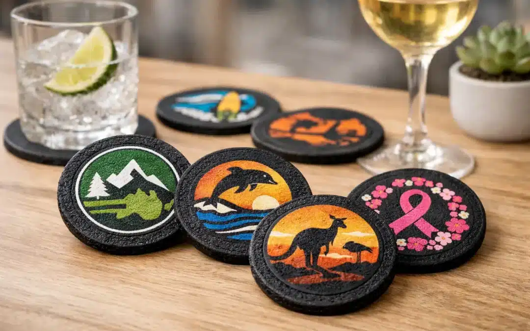
Cork, bamboo and recycled tyre rubber bring a more tactile, considered feel. They suit environmentally minded campaigns, venues and events where reusable products align with the message. Recycled tyre rubber is particularly useful for hard-wearing promotional coasters that need grip and repeated use, while cork and bamboo complement natural, rustic or premium styling.
Acrylic, glass, stainless steel, aluminium, leather and resin can create a more polished presentation for corporate gifts, executive functions, awards nights and premium hospitality settings. These options may involve different decoration methods, so artwork often needs to be simplified. Fine gradients, tiny text and complex photographic images do not translate equally across every surface.
The right answer depends on quantity, budget and desired lifespan. A free digital proof is particularly valuable here, as it lets you check whether the selected material and decoration method support the look you have in mind before production begins.
How to design event coasters with clear artwork
A coaster is a small canvas. The most common design mistake is trying to make it do too much. Guests should understand the main message at a glance, even when a glass is sitting on top of it.
Start with one priority: your logo, event name, monogram, sponsor, call to action or key date. Give that element the strongest position and visual weight. Supporting details can sit around the edge or on the reverse side, but they should not compete with the main message.
For branded events, use approved logo files and keep brand colours consistent with the rest of the campaign. A coaster should feel like part of the event system, alongside signage, menus, lanyards and presentation materials. If the logo is detailed, use a clean background and avoid placing it over patterns or photographs.
For weddings and private celebrations, keep the design personal but restrained. Names, a date and one meaningful graphic or phrase are often enough. The invitation suite can be a helpful reference point for typefaces, colours and motifs, but the coaster does not need to reproduce every decorative element from the stationery.
Make type easy to read
Small text is rarely effective on a coaster. Use a clear typeface, strong contrast and sensible spacing. Script fonts can look elegant for names or a short heading, but body copy, URLs and calls to action should be easy to read without effort.
Avoid placing important wording too close to the outer edge. Production requires a trim tolerance, and curved coaster shapes can make edge text feel crowded. Leave a safe margin around logos, type and key visual elements. This produces a cleaner result and protects important artwork from being cut too close during manufacture.
Use colour with the venue in mind
High contrast generally performs best. Dark artwork on a light base, or light artwork on a dark base, gives the design the clarity it needs in a busy event environment. Pale grey text, subtle metallic effects and low-contrast colour combinations may look attractive on screen but disappear under venue lighting.
If your event has a strong colour palette, select one dominant colour and one or two supporting tones rather than filling every part of the coaster. White space is useful. It makes logos more noticeable, helps messages remain readable and gives the finished piece a professional standard.
Plan both sides before adding more information
Double-sided event coasters can be worthwhile when there is a genuine need for extra content. One side can carry the event identity, while the other includes a sponsor, menu prompt, competition details or a QR code. This is often more effective than crowding both messages onto one face.
A QR code should have a clear purpose. It might lead to a prize draw, event programme, booking page or social campaign, but guests need a reason to scan it. Include a short instruction such as “Scan to enter” or “Scan for the drinks list”, and make sure the code has enough clear space around it to scan reliably.
For venue promotions, consider whether the coaster will remain on tables after the event. A dated offer may create urgency, but an evergreen message can provide more long-term value. This is a useful trade-off to discuss before approving artwork.
Match the shape and finish to the design
Round coasters are familiar and versatile, while square coasters offer a slightly more structured layout for logos and text. Custom shapes can be memorable, especially when they relate directly to a product, logo or campaign, but they are best used when the silhouette remains practical beneath a drink.
Do not choose a shape purely for novelty. A coaster still needs to sit flat, support the glass and fit naturally on tables, bar tops or trays. Complex outlines can also reduce the available print area and add cost, so they are better suited to campaigns where distinctiveness is worth the investment.
Finishes should support the intended experience. A simple absorbent cardboard coaster works well for high-turnover drink service. A heavier rubber, cork or metal style can feel more substantial when the item is intended as a gift or ongoing promotional product. Ask early about the available print process, as this will influence whether fine detail, multiple colours or special effects are appropriate.
Check the practical details before production
Artwork approval is the point where good ideas become reliable production files. Supply high-resolution artwork where possible, preferably in a format that preserves sharp lines and brand colours. If you only have a logo from an email signature, social media profile or screenshot, it may not reproduce cleanly at print size.
Check all spelling, dates, phone numbers, QR codes and sponsor names before approving the digital proof. It is easy to focus on the overall appearance and miss a small error in an event date or web address. If several stakeholders are involved, nominate one person to provide final approval so changes do not become confused.
Quantity and timing matter too. Order enough to cover guest numbers, staff areas, VIP tables and a sensible allowance for extras. For large events, it is usually better to have spare coasters than to run short during service. Build production and freight time into your schedule, especially around major event seasons or if you are choosing a specialised material or custom shape.
Create a coaster guests will notice and use
The strongest event coaster designs are clear, useful and appropriate to their setting. They do not rely on tiny text or crowded artwork to make an impression. Instead, they pair a well-chosen material with a confident visual message and enough production planning to ensure the finished product matches the proof.
Whether you are organising a national conference, a venue promotion, a club function or a personal celebration, experienced design support can remove uncertainty from the process. Drink Coaster can provide a free digital proof so you can assess the layout before production and move forward with confidence. A coaster may be a small part of the event, but when it is designed with purpose, it stays in guests’ hands and keeps your message in view.